Learning Analytics: Courses Layer
Last updated: September 30, 2026
Overview
You can think of the Course Layer as the place to go after the Overview Layer when you want to see how individual courses are performing, and to drill into one course to see how users are engaging with its lessons, quizzes, and overall completion rate.
What you will see when you open the Course Layer
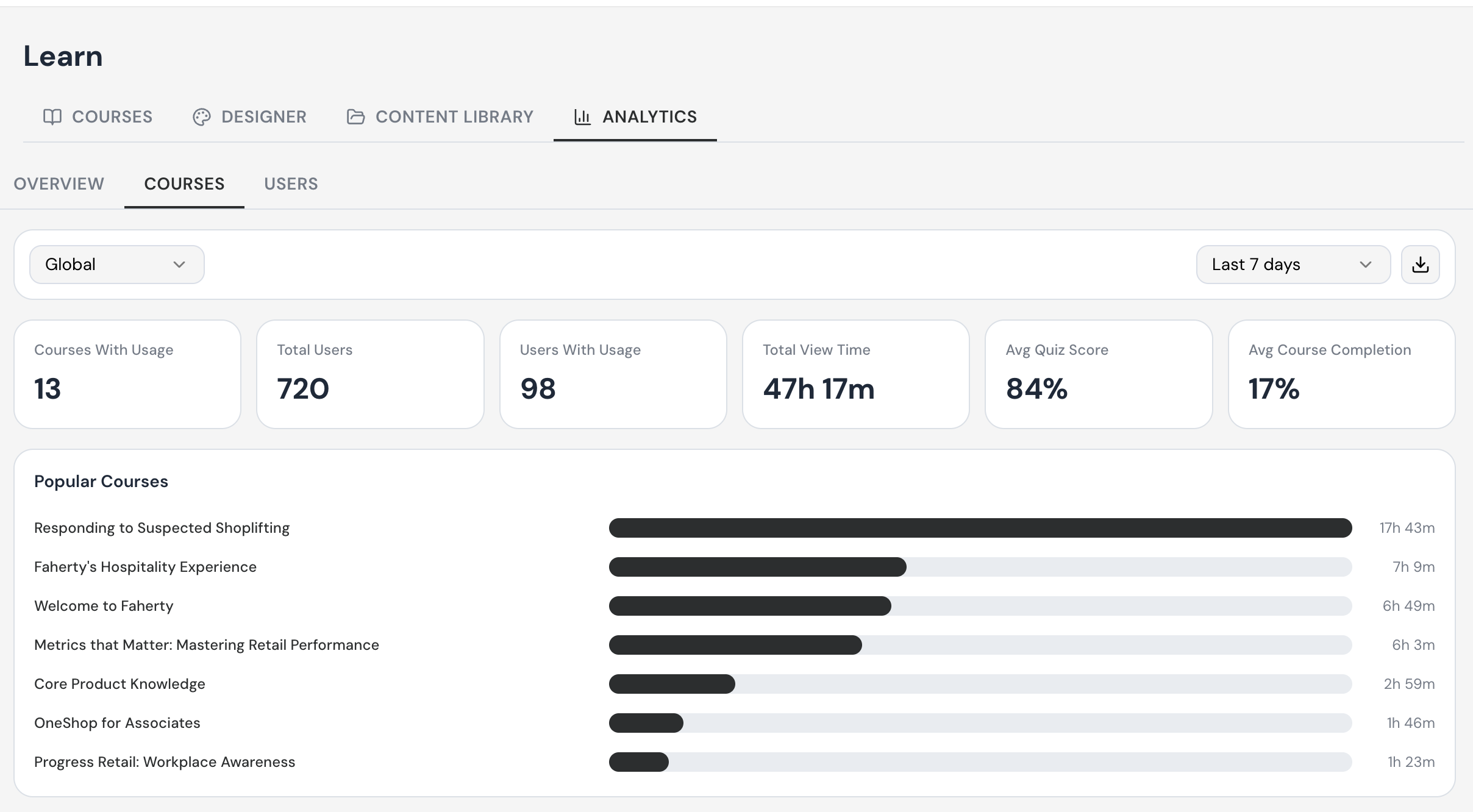
The Course Layer opens to a single page with three main areas: a filter bar at the top (carrying over the scopes you set on the Overview Layer), an Overview panel of course-level KPIs on the left (Courses With Usage, Total Users, Users With Usage, Total View Time, Avg Quiz Score, Avg Completion), and a Popular Courses panel on the right showing each course with its total view time as a horizontal bar.
Tip: The Course Layer only shows courses that have had activity in the selected time window. If a course you expect to see is missing, expand the time window to find it.
Why the Course Layer Matters
Overview
The Course Layer shows you where engagement is happening across your courses. In a single view, you'll see:
Where attention is concentrated.
Discover a list of courses that are showing the most engagement
The Course Layer is where you go to analyze engagement and Average Course Completion across the full dimension of courses.
Identify your highest- and lowest-performing courses
Spot content that isn't being used or might need to be updated
Understand which courses are shaping your company-wide averages
Tip: When you are checking compliance for a specific course, set the time scope to a window that matches the rollout date of the course. A "Last 7 days" view will only show recent engagement; "Last 90 days" or "Last 12 months" is usually a better fit for compliance reporting.
Scope Persistence Between Layers
Overview
One of the most useful behaviors of Learning Analytics is that the scopes you set on one layer carry over when you move to the next layer. If you set a Store and a "Last 7 days" window on the Overview Layer, those same scopes are already applied when the Course Layer opens.
How scope persistence works
When you switch from the Overview Layer to the Course Layer, the platform locks in your previously selected location and time scopes. You do not have to re-pick them. This makes it much faster to drill from a high-level summary into the courses driving those numbers, because you already know you are looking at the same scope of data.
Changing scope on the Course Layer
You can still change scope at any time directly from the Course Layer. The scope drop downs work exactly the same way as they do on the Overview Layer — pick a different location level or a different time window and every metric, chart, and table on the page recalculates immediately.
Tip: As you move through the layers, you will not have to re-click what you were already looking at in the previous layer. This makes drill-downs from Overview to Course to User very fast.
Finding Courses With Activity
Overview
The Course Layer is built around two questions: how many courses are being engaged with, and which specific courses are they? The Overview panel on the left answers the first question; the Popular Courses panel on the right answers the second.
Reading the Overview panel
On the left side of the page, the Overview panel summarizes course-level engagement:
Courses With Usage — the number of courses that have had any activity in the selected window.
Total Users — the number of users in scope with an active subscription.
Users With Usage — how many of those users actually opened a course.
Total View Time — the total amount of time spent viewing courses in the window.
Avg Quiz Score / Overall — the average quiz score across the courses with activity.
Avg Completion / Overall — the average percentage of course content that users complete.
Reading the Popular Courses panel
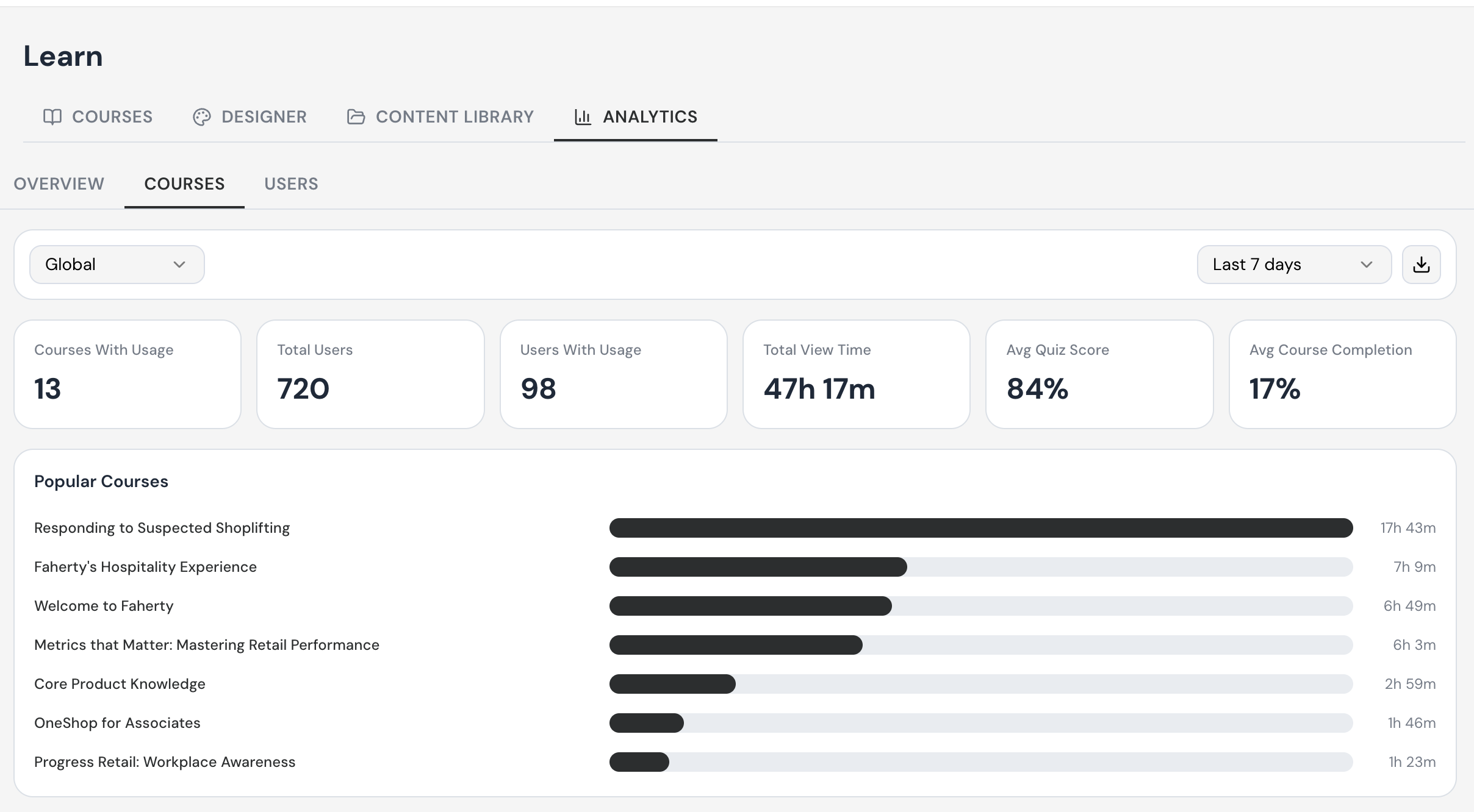
On the right, Popular Courses lists the top courses based on learning time.
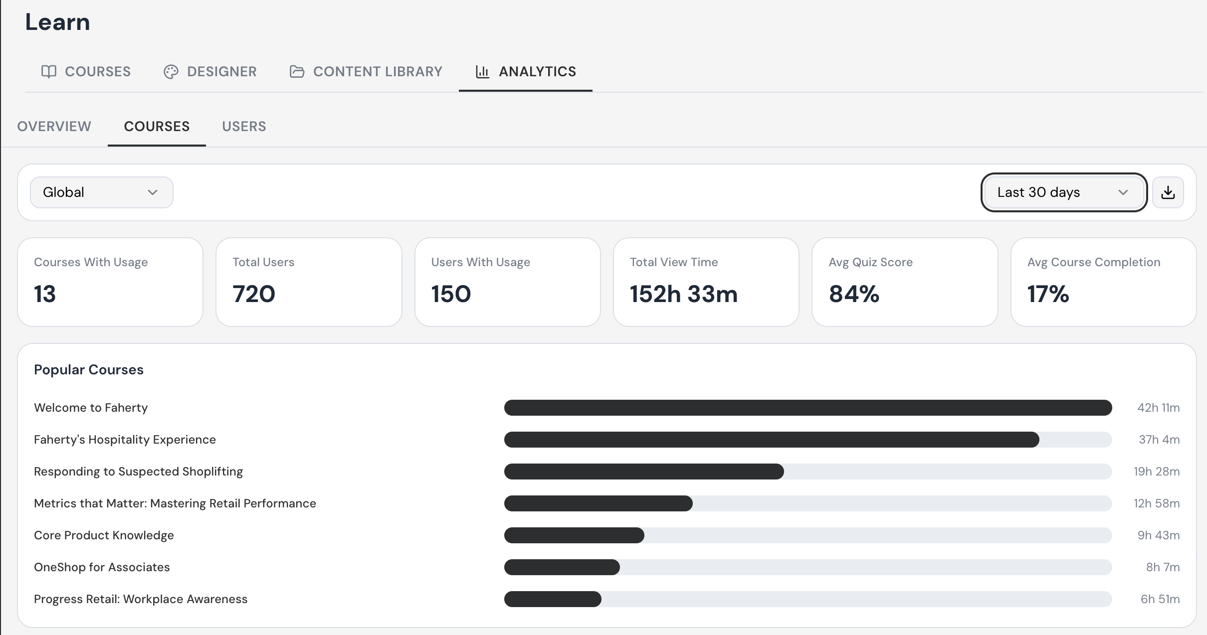
Expanding the time window to find more activity
Open the time scope dropdown at the top right of the page.
Change the window from "Last 7 days" to a wider window such as "Last 30 days", "Last 90 days", "Last 12 months", or "Select Dates".
Watch the Overview panel and Popular Courses list update in real time — you should see additional courses appear if they had activity within the wider window.
Drilling Into a Specific Course
Overview
Once you have identified a course you want to investigate, click its title in the Popular Courses panel. This opens a course detail page that shows every piece of activity for that one course within the currently selected scope.
How to open a course detail page
From the Course Layer, locate the course you want in the Popular Courses panel.
Click the course title (it appears as a clickable link). For example, "Metrics that matter: Mastering Retail Performance."
The course detail page loads, with the course name shown at the top of the page.
All metrics on the page reflect only that course, within your currently selected scope.
What is on the course detail page
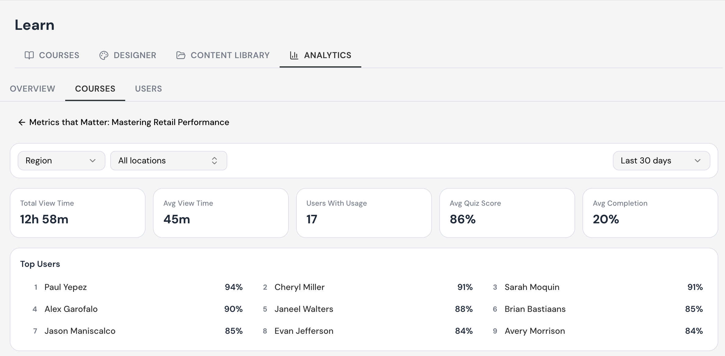
The course detail page is structured similarly to the layer landing page, but every metric is calculated for the single course you opened:
You can get to this page from Learn > Analytics > Courses, by clicking into any course listed in the Popular Courses panel. That takes you into the detail view for that specific course — in this example, "Metrics that Matter: Mastering Retail Performance."
Use the back arrow next to the course title to return to the main Courses list at any time.
The Region and All locations filters let you narrow the data down to a specific region or store, instead of viewing performance across your whole account.
The date range selector (defaulting to Last 30 days) controls the time window for every metric on the page. Change it to see performance over a different period.
Total View Time shows the combined number of hours and minutes all users have spent viewing this course.
Avg View Time shows how long the average user spends on the course, which can help flag content that's running too long or too short.
Users With Usage shows how many people have actually engaged with the course during the selected date range.
Avg Quiz Score shows the average score across all users who've taken the course quiz, giving you a quick read on how well the material is landing.
Avg Completion shows the average percentage of the course completed by users with usage, so you can see whether people are finishing what they start.
The Top Users panel ranks the highest-scoring users on this course's quiz, from highest to lowest, so you can quickly recognize top performers or identify coaching opportunities.
Reading the Quizzes Panel, Leader Board, and User Activity
Overview
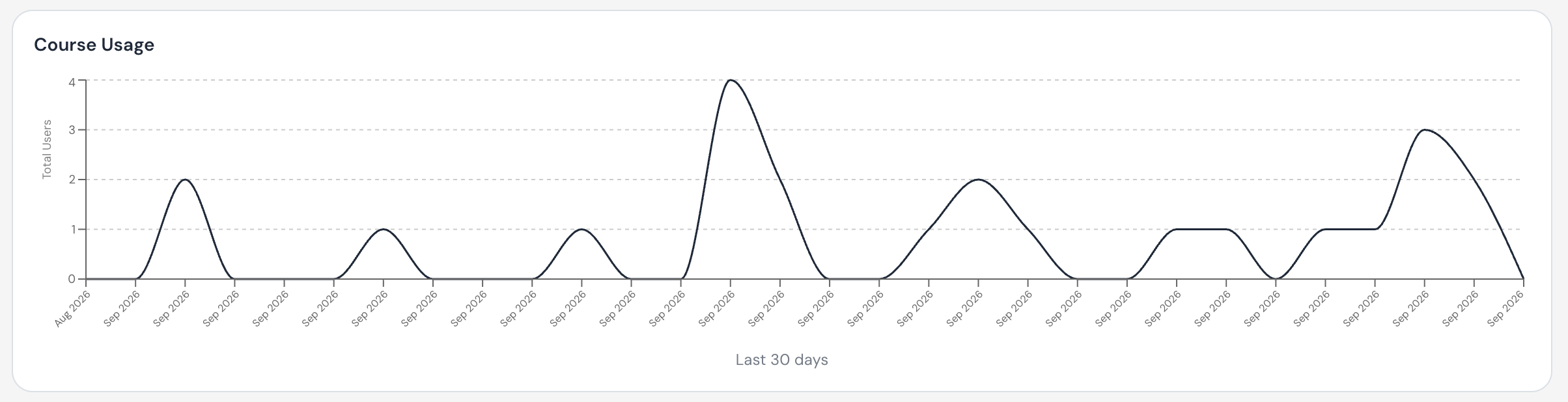
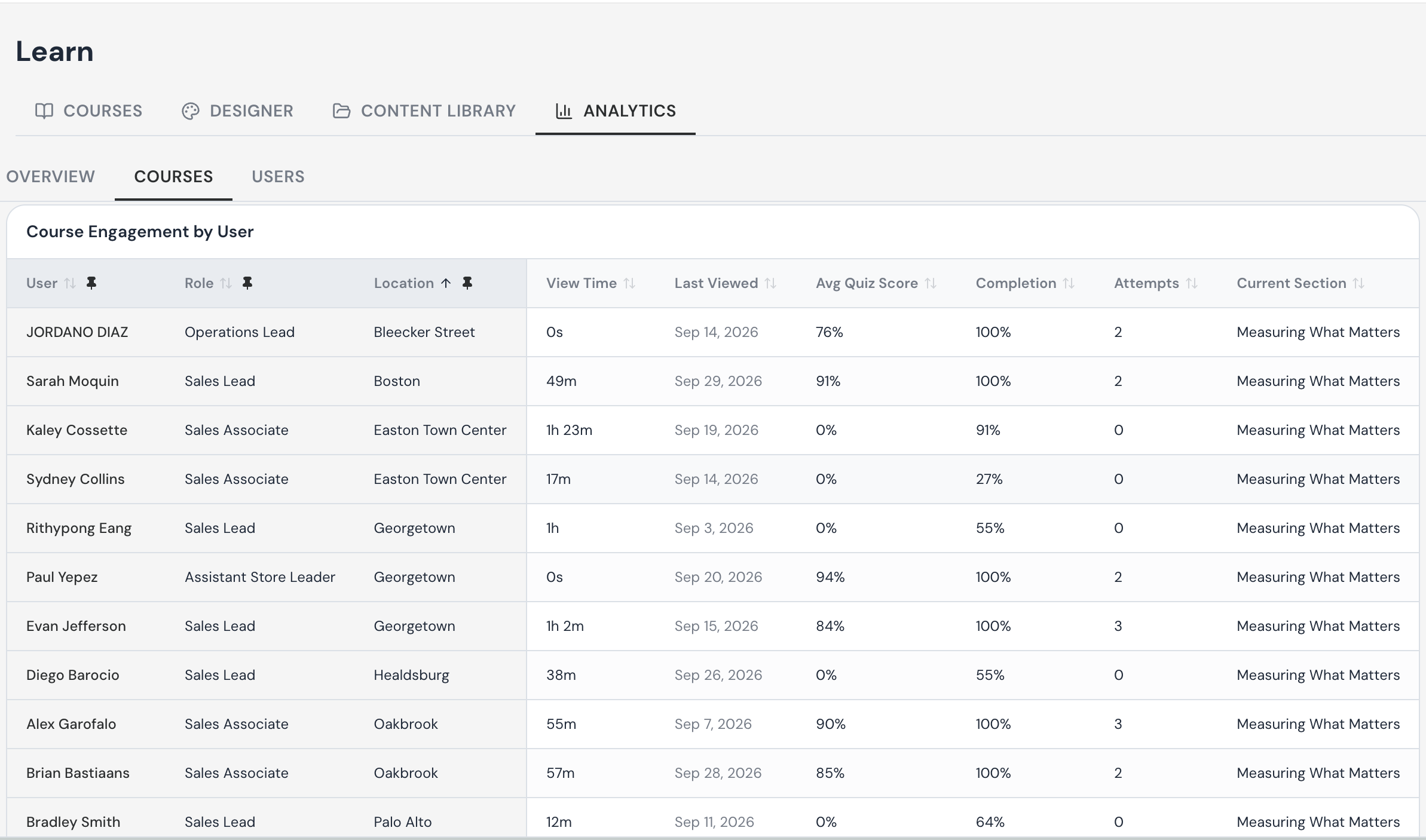
Below the Course Usage chart on a course detail page, there are three more sections that go deeper than the headline KPIs: the Quizzes panel, the Course Engagement by User, and the underlying user activity table. Together they answer the question "who is engaging, and how much engagement.
The Quizzes panel
The Quizzes panel lists every quiz inside the course you are looking at. For each quiz it shows the section, unit, quiz name, total view time, and average quiz score across users in scope. This is the right place to check whether a single quiz is dragging the average down.

Top Users
The Top Users Board shows the top users on this course by quiz score, with their score listed as a percentage. It is a useful at-a-glance view for recognizing high performers in this specific course. You can click directly on the user to see their individual profile details.

Course Engagement by User
Scroll further down the course detail page and you will reach the underlying activity table. This is the row-by-row record of every user who has engaged with this course in the selected window. The columns include:
User — Name of the user.
Role — the user’s role title.
Location — the store or location the user is associated with.
View Time — the total time that user spent on this course.
Last Viewed — the most recent date this user opened the course.
Avg. Quiz Score — the user’s average quiz score for this course.
Completion — the percentage of course content the user has completed.
Attempts — how many quiz attempts the user has made.
Current Section- the section the user left off in.
Tip: The user activity table only contains rows for users who have actually engaged with this course in the selected window. If a user is missing, it generally means they have not opened the course yet — not that they have been removed.
Course Engagement by Location
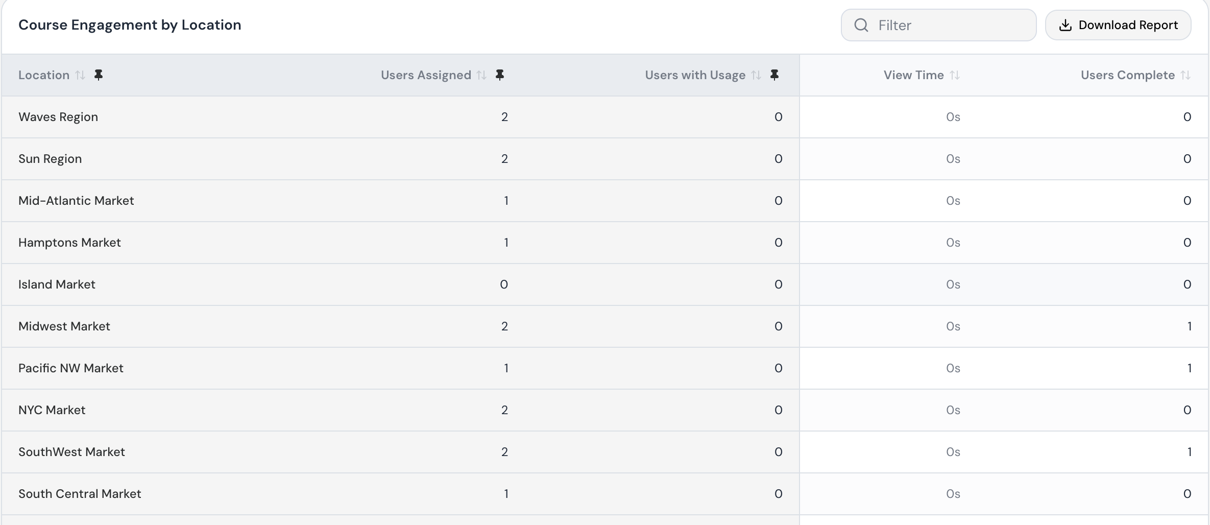
Scroll below the Top Users panel on a course's detail page to find Course Engagement by Location. It breaks down how each region, market, or store is engaging with that specific course.
Use the Filter field to quickly search for a specific location by name.
Click Download Report to export this table as a file you can share or analyze outside the platform.
Location lists each region, market, or store the course has been assigned to. Pin this column (or any column with the pin icon) to keep it visible while you scroll through the rest of the data.
Users Assigned shows how many people at that location have been assigned the course.
Users with Usage shows how many of those assigned users have actually opened or started the course.
View Time shows the total time users at that location have spent viewing the course content.
Users Complete shows how many assigned users have finished the course, so you can quickly spot locations that are lagging behind.
Any column with the sort arrows can be reordered from highest to lowest or lowest to highest, which is useful for quickly finding your top- or bottom-performing locations.