Learning Analytics: Overview Layer
Last updated: September 30, 2026
Overview Layer
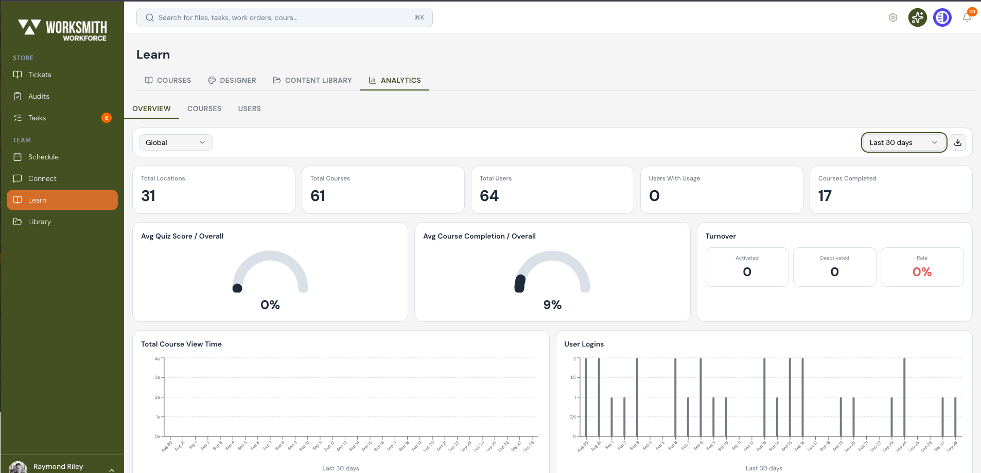
Learning Analytics inside the platform is delivered in three layers: the Overview Layer, the Course Layer, and the User Layer. This guide focuses on the first layer — the Overview Layer — which gives you a top-down summary of your organization, courses, and user activity.
You can think of the Overview Layer as the first dashboard you should check whenever you want to see how learning is performing across the business as a whole.
What you will see when you open the Overview Layer
The Overview Layer opens to a single page with three main areas: a filter bar at the top (scopes and date range), a row of KPI cards in the middle (Total Locations, Total Courses, Total Users, Users With Usage, Courses Completed), and detail panels below (Avg Quiz Score, Avg Course Completion, Turnover, Total Course View Time, User Logins, and an overview table when a scope is selected).
Tip: The overview data reflects only users who have an active account. If a location or user has been deactivated or filtered out, it will not appear in these counts.
Filtering Data with Scopes (Location & Time):
Overview
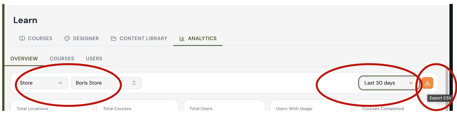
Above the KPI cards you will see a row of dropdown menus. These are the scope filters and they control which data populates the entire Overview Layer in real time. There are two kinds of scope you can apply at the same time: location scope and time scope.
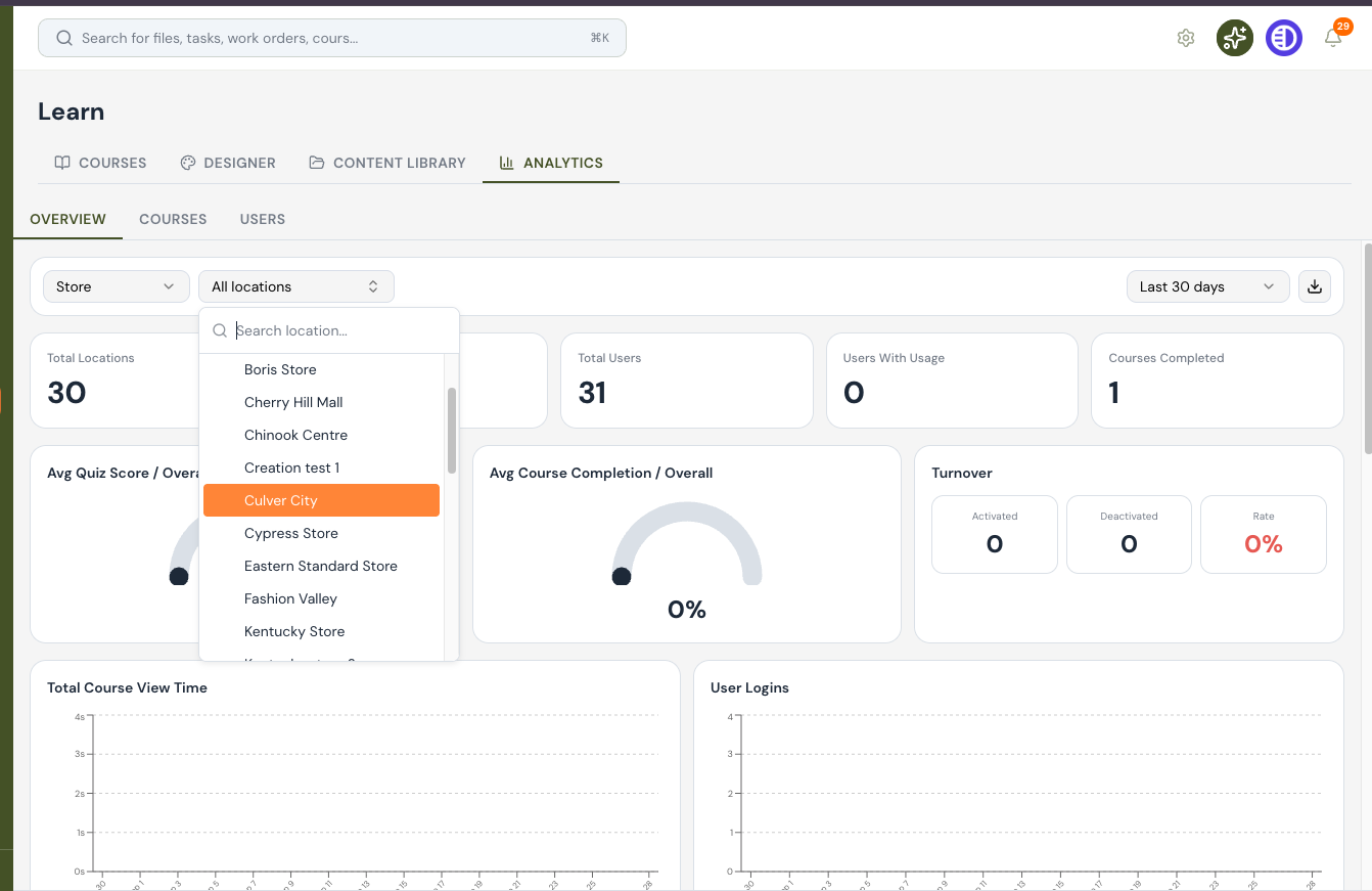
Scope by location:
The location scope dropdown lets you narrow the report to a specific level of your organization. You can choose from the following levels:
Global — every location in your company.
Region — a specific region.
District — a specific district within a region.
Store — a single store location.
Department — a specific department.
When you pick a location level, the second dropdown updates so you can choose the specific region, district, store, or department you want to look at.
If "store" is selected without a specific store in the dependent dropdown field, ALL stores are automatically selected. This also applies to region and district filters.
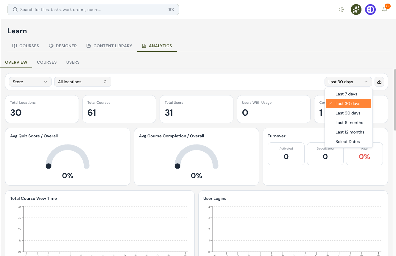
Scope by Time:
The time scope dropdown on the right controls the date range used for the entire dashboard. You can choose from the following preset windows:
Last 7 days
Last 30 days
Last 90 days
Last 12 months
Customize select dates
How filtering changes the numbers
As soon as you change either scope, every KPI card, chart, and table on the page is recalculated in real time.
Tip: Always set the location and time scopes before you start interpreting the dashboard. The same KPI can tell two very different stories at "Last 7 days, Global" versus "Last 12 months, Single Store".
Reading the KPI Indicators
Overview
The middle of the Overview Layer is a row of high-level KPI cards followed by a set of detail panels. Together, these are the indicators that give you a quick read on subscription, course, and user activity for the scope and date range you have selected.

The five top-row KPI cards
Reading left to right, the five top-row cards are:
Total Locations — the number of active locations in the current scope.
Total Courses — the number of courses available to users in the current scope.
Total Users — the number of users in the current scope with an active subscription.
Users With Usage — how many of those users actually opened a course in the selected window.
Courses Completed — the total number of course completions in the selected window.

The detail panels below
Below the KPI cards you will see panels that describe quality and turnover, not just volume:
Avg Quiz Score / Overall — the average quiz score across all users in scope.
Avg Course Completion / Overall — the average percentage of course content that users complete.
Turnover (Activated / Deactivated) — how many user accounts were activated or deactivated in the selected window.
Tip: A "0" in the Activated and Deactivated columns means there has been no change in your roster during the selected window — useful for verifying that your headcount is stable.
Working with Charts and the Overview Table
Overview
Below the KPI panels are two trend charts (Total Course View Time and User Logins) and, when a specific scope is applied, an overview table at the bottom of the page. Together they let you see patterns over time and compare performance across locations.
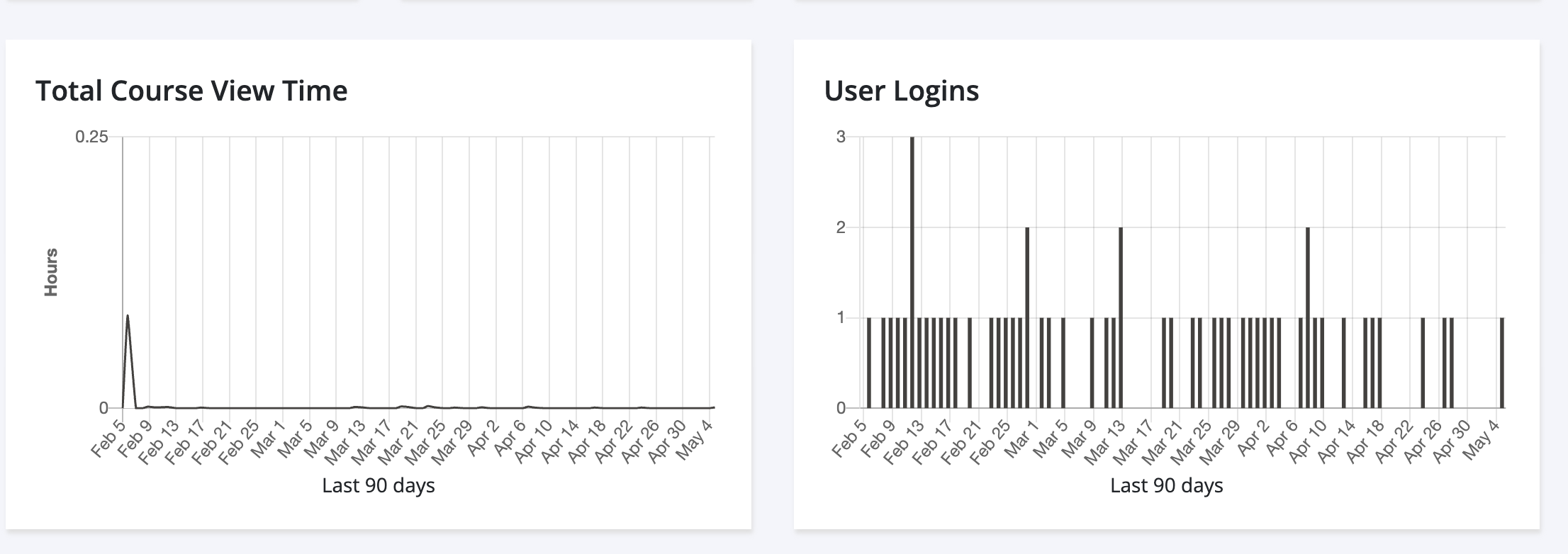
Reading the trend charts
Scroll down to the Total Course View Time and User Logins charts.
Identify the peaks (the tallest spikes on each chart) — these are your highest-activity days.
Hover your mouse over any peak to reveal a tooltip with the individual data point (date and value).
Use the same hover behavior on both charts to read exact daily numbers.
Using the overview table
Whenever you select a location-level scope (such as Store, District, or Region), an overview table appears at the bottom of the page. The table breaks the headline KPIs down by individual location so you can compare them side by side.
Apply a location scope (for example, Store) using the scope filters at the top of the page.
Scroll down past the charts. The overview table appears once a scope is selected.
Click any column header to sort the table by that column. Click the header again to reverse the sort order.
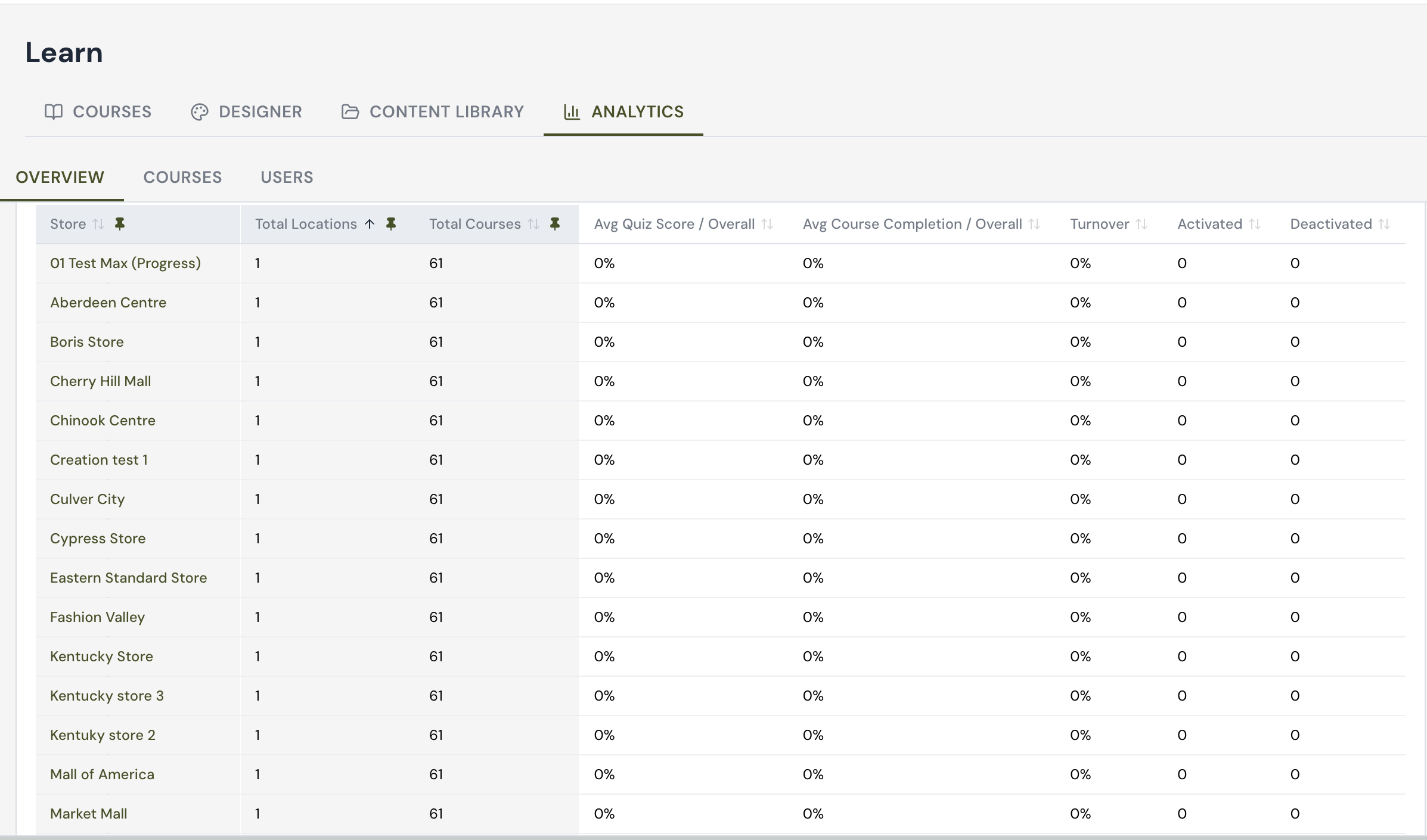
Overview Analytics Table
Navigate to Learn > Analytics > Overview to see this table. It gives you a store-by-store snapshot of learning activity across your entire account, all in one view.
Store lists each location or store profile in your account. Click the pin icon next to this column (or any column) to lock it in place so it stays visible as you scroll right through the rest of the table.
Total Locations shows how many physical locations are tied to that store record. Click the arrows to sort ascending or descending.
Total Courses shows how many courses are currently assigned to that store's team.
Avg Quiz Score / Overall shows the average score across all quizzes taken by users at that store, giving you a quick read on comprehension.
Avg Course Completion / Overall shows the average percentage of assigned course content that's been completed at that store, so you can spot locations falling behind.
Turnover reflects the percentage of staff changes recorded for that store over the selected period, which can help explain dips in completion or quiz scores.
Activated and Deactivated show how many user accounts were turned on or off at that store, useful for tracking onboarding and offboarding activity.
Every column with the up/down arrow icon can be sorted, and every column with the pin icon can be pinned, so you can build the view that's most useful for your team's reporting needs.
If every row reads 0%, that usually means no quiz or course activity has been recorded yet for that reporting period, not that the data is missing.
Scrolling for additional columns
There are more columns to the right than fit on screen. Use the small arrow on the right edge of the table — or scroll horizontally — to reveal the remaining columns (such as Turnover, Activated, Deactivated, and Total View Time).
Exporting Analytics Data to CSV
Overview
Every view of the Overview Layer can be exported as a CSV file, including the raw data behind the KPI cards, the charts, and the overview table. This is useful when you want to take the data into Microsoft Excel, Google Sheets, or any other spreadsheet app for further analysis or sharing.
How to export the current view
Set your scopes — pick the location and time range you want to export.
Locate the export button at the top right of the filter bar (it appears just to the right of the date dropdown).
Click the export button. A CSV file containing the current filtered data will download.
Open the CSV file in Microsoft Excel, Google Sheets, or any spreadsheet app that handles CSV.
Tip: The exported CSV reflects whatever scopes are currently applied. If you only want one store or one date window in your spreadsheet, set the filters first and then click export.
What is in the exported file
The CSV export is a snapshot of your top-level learning analytics for the selected date range. Each row represents a scope inside your organization (for example, a department group or a regional banner), and each column gives you one key metric for that scope.