Learning Analytics: Users Layer
Last updated: September 30, 2026
Overview
This article focuses on the third and final layer: the User Layer, which shifts the lens from course performance to individual learner activity.
The User Layer is the place to go when you want to see all of your learners in one table, regardless of whether they have been active or not. Unlike the Course Layer (which only lists courses that had activity in the selected window), the User Layer holds every user in scope, so you can immediately separate the people engaging with learning from the people who are not.
What makes the User Layer different
Every user in scope appears in the underlying table — even users with zero view time.
You can flip between an Aggregate view (grouped totals per user) and a List view (one row per user-course).
Practically every cell in the table is filterable, so you can slice by location, role, course, and more.
You can compare the current time period to the previous one to spot trends in individual learners.
Tip: Because the User Layer holds all learning data regardless of activity, it is the right starting point when you need to identify users who have not yet engaged with their training.
Top Users and Overview Metrics
Overview
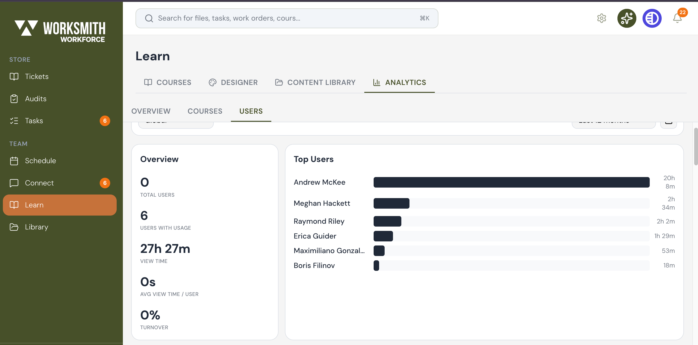
When the User Layer first opens, you land on a page with three main areas: the scope filter bar at the top, an Overview panel of user-level KPIs on the left, and a Top Users panel on the right that ranks individual learners by total view time.
Reading the Overview panel
The Overview panel on the left summarizes user-level engagement for the selected scope:
Total Users — the number of users in scope with an active subscription.
Users With Usage — how many of those users have actually opened a course in the selected window.
View Time — the total amount of time spent viewing learning content across all users in scope.
Avg View Time / User — the average time spent per user in scope.
Turnover — the percentage of users who left in the selected window.
Reading the Top Users panel
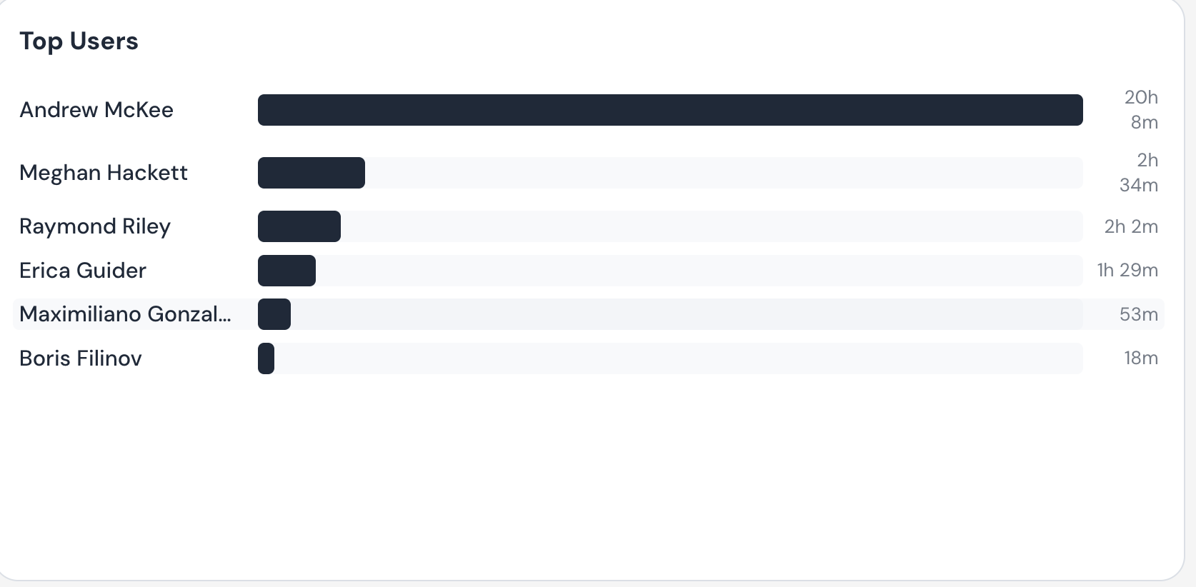
On the right, the Top Users panel shows your highest-engagement learners. Each user appears with a horizontal bar representing their total view time, so you can immediately see who is spending the most time on training. This is a good place to start when looking for power users or for staff to recognize.
Tip: The Top Users panel and the Overview KPIs both follow the scope filters at the top of the page. Change the time window or location and the rankings update immediately.
Aggregate vs List: Two Ways to View Your Users
Overview
Scroll down past the Overview and Top Users panels and you will reach the underlying table — the heart of the User Layer. This table has two views you can flip between: Aggregate and List. Each view answers a different question.
Aggregate view
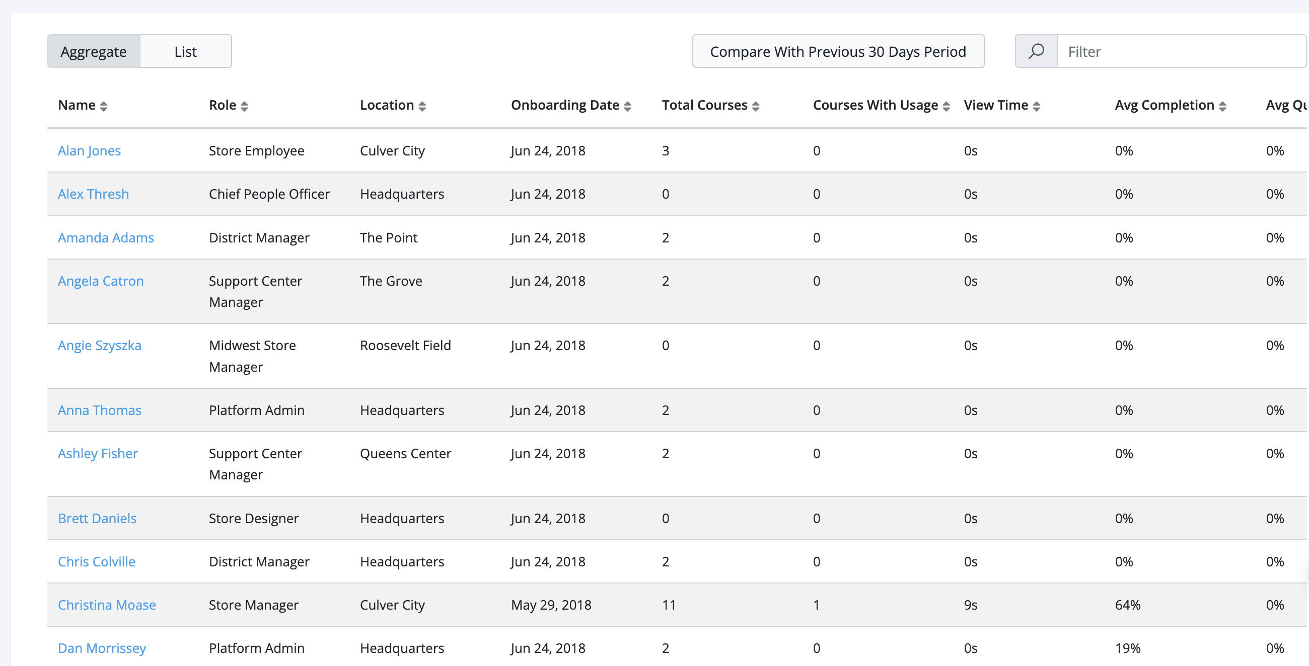
The Aggregate view shows one row per user, with their totals rolled up across every course. It is a really effective way to see, full stop, who is engaging with learning and who is not. Each user appears once with their total view time, total courses, and other rolled-up metrics.
List view
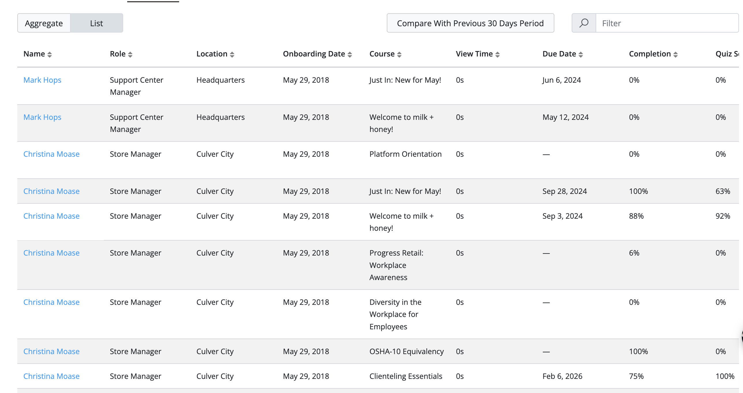
The List view breaks the same data apart so that each user appears multiple times — once per course they are enrolled in. This makes it easy to see exactly which courses an individual user is spending time on, rather than just their grand total.
Switching between views
Locate the Aggregate / List toggle directly above the underlying table.
Click "Aggregate" to roll the data up to one row per user.
Click "List" to break the data down to one row per user-course combination.
All sort orders, filters, and the comparison toggle apply to whichever view you are currently in.
Tip: Use Aggregate when you want a fast yes/no read on who is and is not engaging with learning. Switch to List when you need to see specifically which course a user is spending their time on.
Aggregate View: Separating Engaged Users From Non-Engaged
Overview
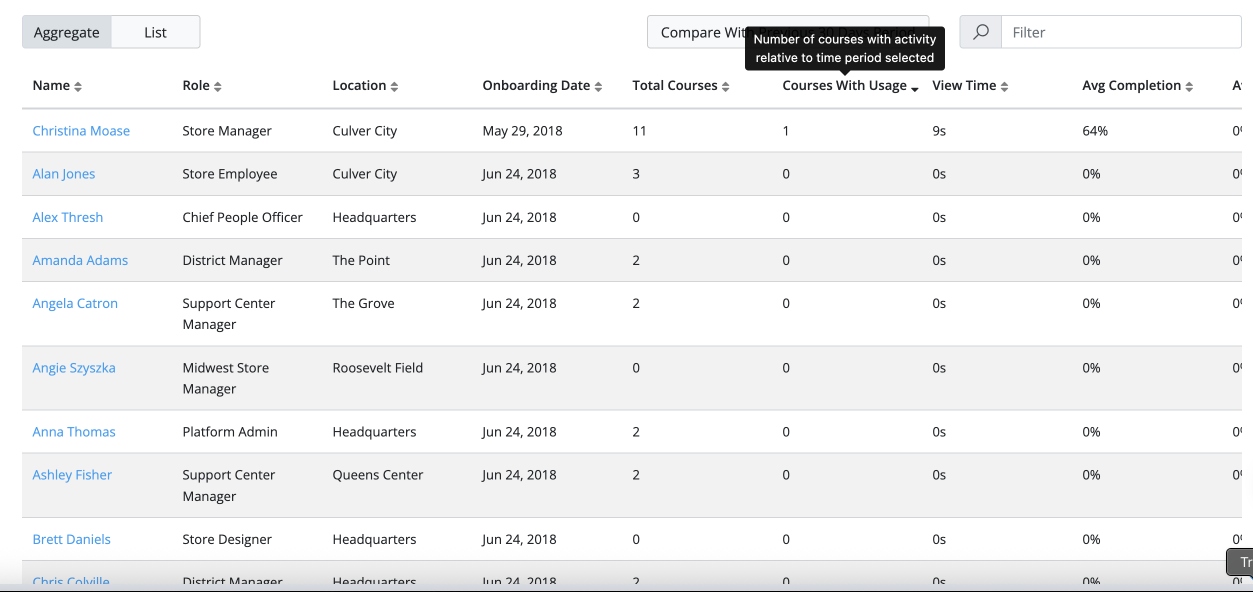
The Aggregate view is your fastest path to answering one question: out of every user in scope, who is actually engaging with learning, and who is not? Sorting by Courses With Usage splits the table cleanly into the two groups.
Sorting by Courses With Usage
Open the User Layer and scroll down to the underlying table.
Make sure the Aggregate / List toggle is set to Aggregate.
Click the Courses With Usage column header to sort.
Users with the highest number of courses opened will rise to the top; users with zero will sink to the bottom.
Why this matters
Because the User Layer holds every user — including those who have not opened a single course — sorting by Courses With Usage is the cleanest way to see the engagement gap on a single screen. Users with a 0 in the Courses With Usage column have not engaged at all in the selected window.
Tip: Combine this sort with a location filter (for example, just one store) to see which specific team members in that location have not yet engaged with their training.
List View: Sorting by View Time to See Where Time Is Spent
Overview
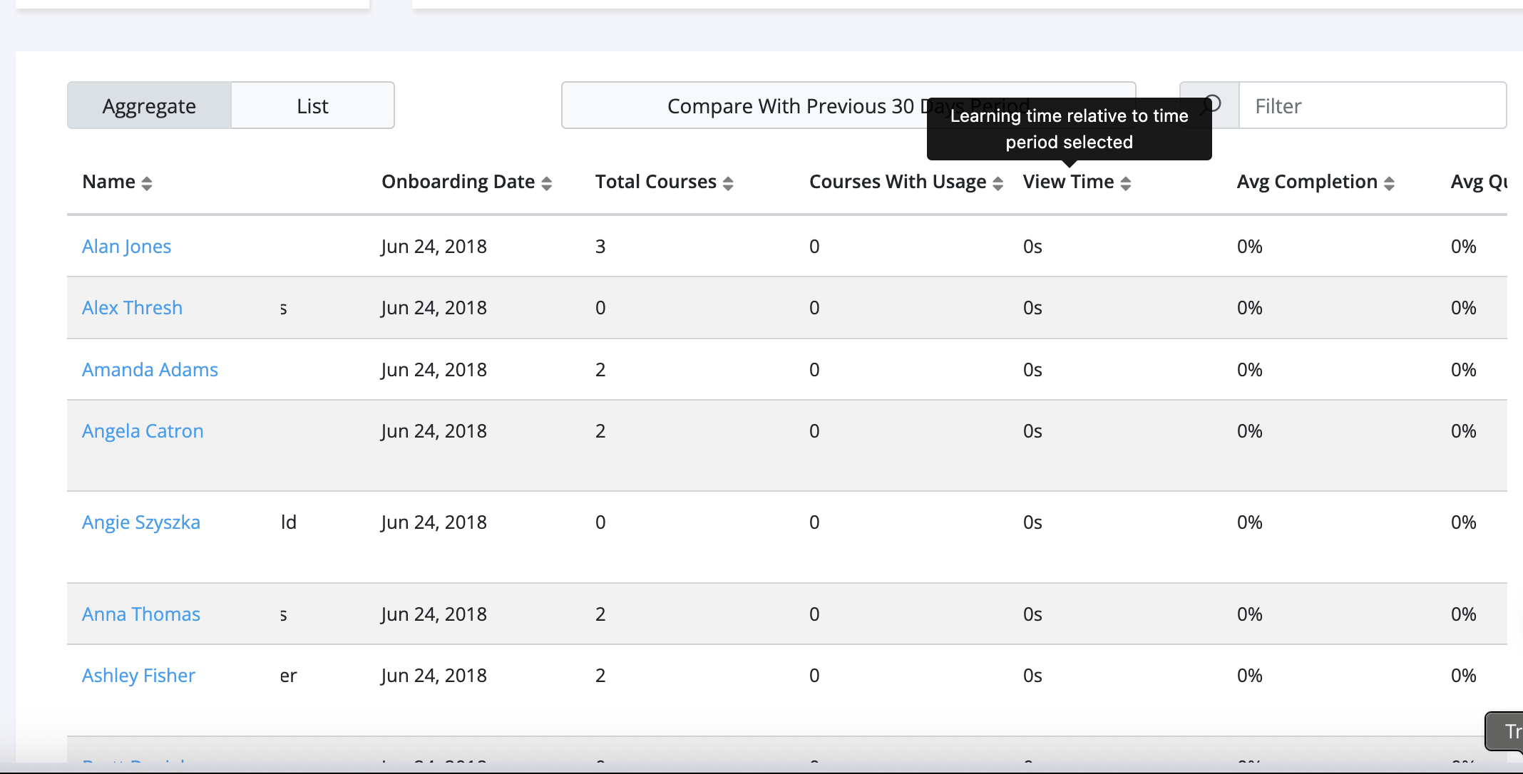
Once you have used the Aggregate view to identify who is engaging, the List view lets you see exactly where each user is spending their learning time. Switching to List and sorting by View Time shows the most time-consumed user-course combinations at the top.
How to sort by View Time in the List view
Click "List" on the Aggregate / List toggle to switch into List view.
Find the View Time column in the table header.
Click View Time once to sort descending; the longest view-time rows rise to the top.
Click again to flip the sort direction if you want to see the lowest view-time rows.
Reading individual rows
Because each user appears once per course in the List view, the rows tell you exactly which course is driving each user’s view time. This is the right place to look when you want to understand "is this person spending their time on the right content?" rather than just totals.
Tip: View Time is always relative to the selected time period at the top of the page. If you change the time scope from "Last 30 days" to "Last 90 days", every View Time number recalculates immediately.
Comparing With a Previous Time Period
Overview
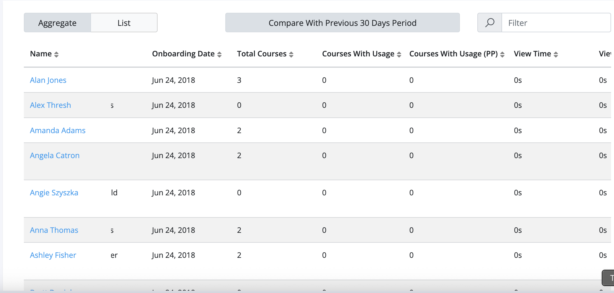
The User Layer also has a built-in period comparison feature. Above the underlying table, a "Compare With Previous [N] Days Period" toggle adds a side-by-side comparison column so you can see whether each user’s engagement is up or down versus the previous equivalent window.
How to enable period comparison
Set the time scope at the top of the page to the window you want to analyze (for example, "Last 30 days").
Click the "Compare With Previous [N] Days Period" toggle directly above the underlying table.
A comparison column is added to the table, showing each metric versus the previous equivalent window.
Sort and filter the table as usual to focus on users whose engagement has shifted up or down.
Tip: Period comparison is the fastest way to spot users whose engagement has dropped off, even if their absolute numbers still look reasonable. Look at the change indicator alongside each value.
Filtering and Exporting User Data
Overview
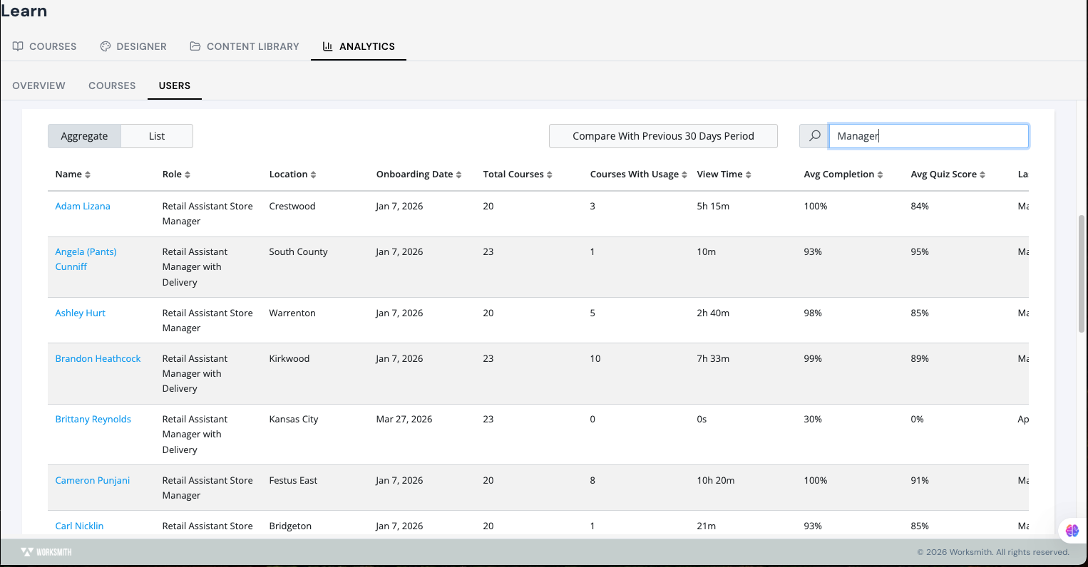
On the User Layer, practically every cell in the underlying table is filterable. This makes the table extremely flexible: you can scope down to a single store, a single role, a single course, or any combination of those, and the export will respect whatever you have filtered to.
How to filter the table
Click the Filter field above the underlying table, or click directly on the column you want to filter.
Pick the value you want to filter by (for example, a specific role (Manager).
The table immediately recalculates to show only the rows that match your filter.
Apply additional filters on other columns to narrow the view further.
Example — filtering to a specific role
For example, typing Manager into the filter narrows the table down to every user whose role contains that word — in this case, Retail Assistant Store Managers and Retail Assistant Managers with Delivery. From there, you can quickly compare how that population is performing as a group.
Exporting the filtered data
Once you have filtered the table to the slice you care about, you can export just that data. The export respects your filters, so the file you download will only contain the rows currently visible in the table.
Tip: Combine filters with the Aggregate view to export a clean roster of who has and has not engaged with learning in a single store, role, or region — ideal for follow-ups with managers.
Drilling Into an Individual User Profile
Overview
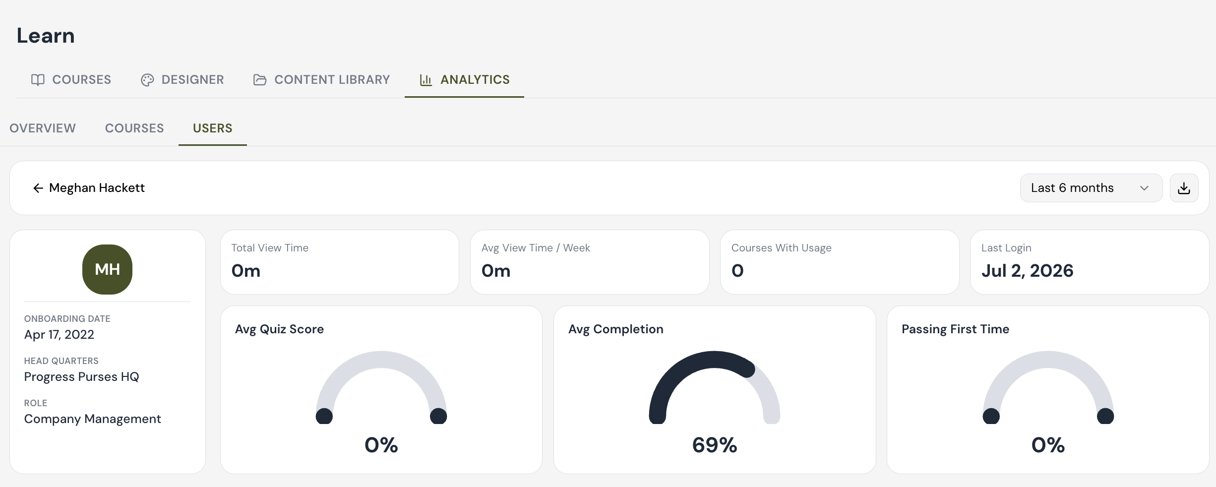
The last thing the User Layer is built for is drilling all the way down to an individual user. Clicking through any user name in the underlying table opens that user’s profile page, where every metric on the page is calculated for that one person.
How to open a user profile
Click any user’s name in the underlying table. The profile page loads with the user’s photo and basic details on the left, and a row of high-level engagement KPIs across the top.
What is on a user profile page
A user profile page is organized around three pillars that summarize the user’s engagement, when they are logging in, and how much they are consuming in terms of learning:
Engagement- Total View Time, Avg View Time / Week, Courses With Usage, and Last Login.
Last Login- We do track each user's last login timestamp — if it's been more than 24 hours since they last logged in, the system will display the actual date instead of a relative time (e.g., "2 days ago" becomes "Aug 18").
Courses- Their overall course subscription, with completion percentages, quiz scores, and view time per course.
Below the headline KPIs, the profile page includes a User Activity bar chart showing this user’s view time per day, and a per-course table with View Time, Last Viewed, Completion, Quiz Score, Attempts, and Current Section.
Reading the Courses Table
The per-course table on a user profile lists every course this user is subscribed to. For each course you see View Time, Last Viewed, Completion, Quiz Score, Attempts, and the Current Section they are working on, and status. This is the right place to look when you want a single learner’s full transcript across all of their courses.